Goodreads UI Redesign
Figma
During this UI project, I was tasked to give a “makeover” to an outdated mobile application of my choice using Figma. After undergoing light research and testing, I designed a fresh and new visual aesthetic for the app, Goodreads.
This makeover includes reworking the user flow and a reapplication of the branding including typography, buttons, colors, grid/layout, icons, UI components, and photos.
Company Vision
Goodreads was motivated by the belief that there could be a better way to discover and discuss books.
The Problem
The existing Goodreads app is outdated, challenging to read, lacks hierarchy, and overall lacks enthusiasm for the company’s vision.
My Solution
My solution is to design a book logging app that appeals to younger audiences, offers fun personality, and improves overall legibility.
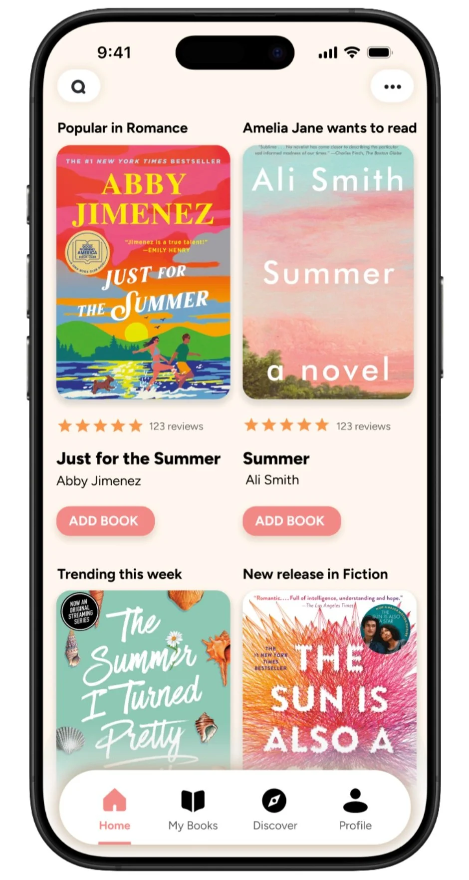
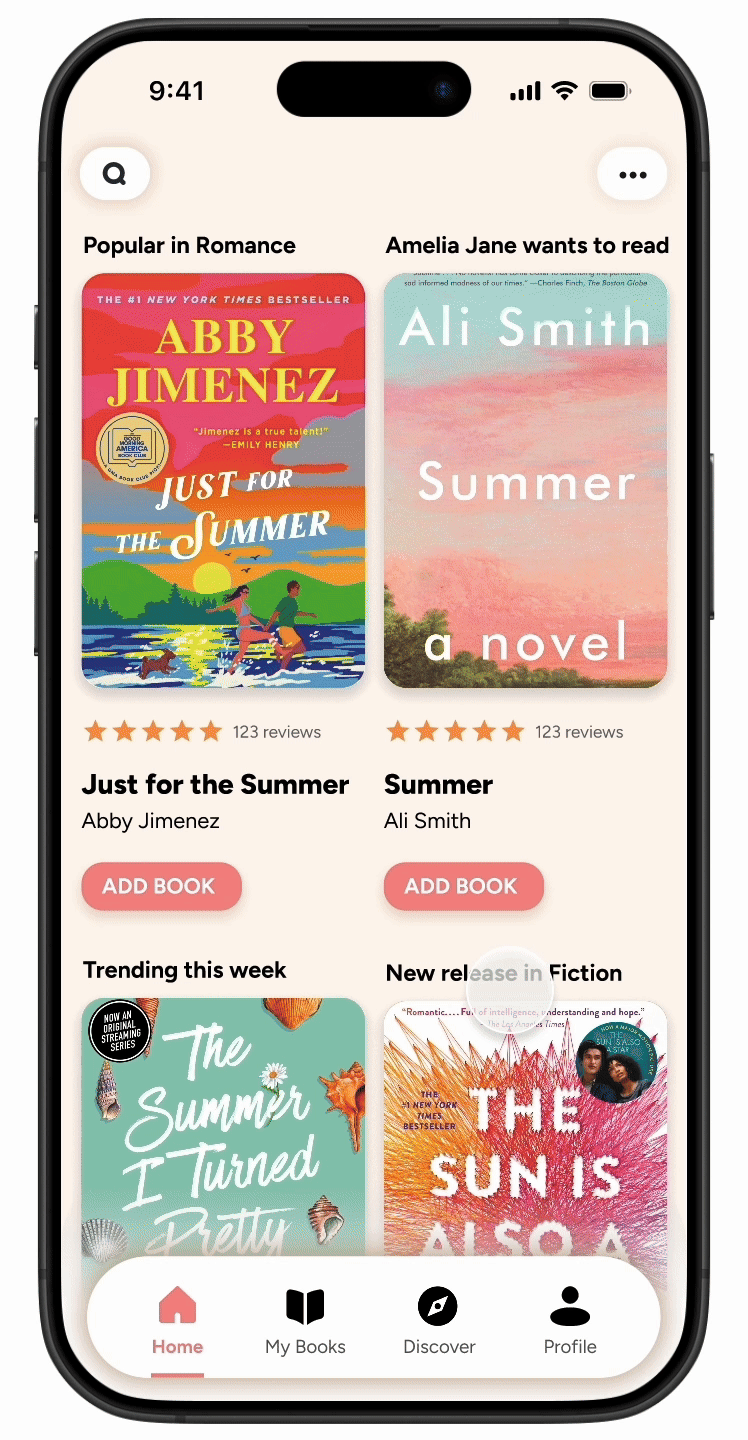
Home
Book Details

Profile

Secondary Screens


Home Prototype
The redesigned layout makes the books the focal point of the homepage.
A refresh on color scheme and fonts modernizes the app.
Easy to read and recognize icons.
Improved hierarchy of info makes it much easier to digest the content.
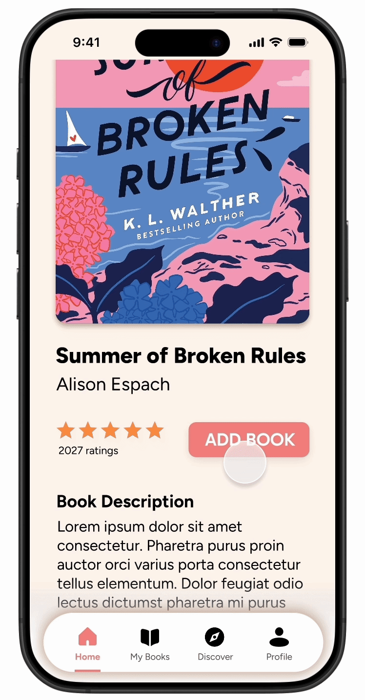
Book Details Prototype
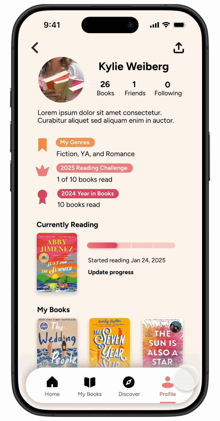
Profile Prototype
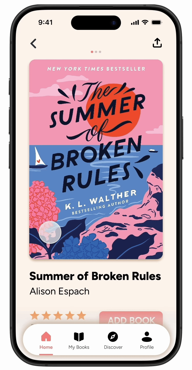
The book cover is the focal point.
Larger type size and improved typographic hierarchy.
Easy to read.
Fun pops of color!
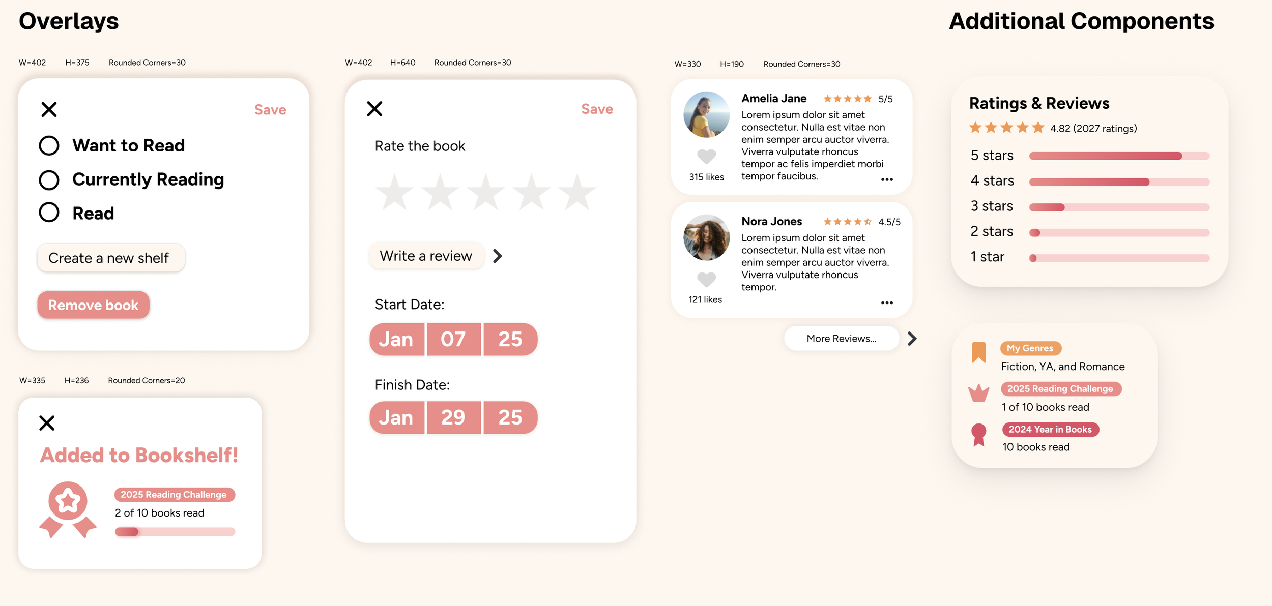
Adding to Bookshelf
Easy & intuitive step-by-step user flow.
Automatically adds book to reading challenge after book is marked as read.
Gratifying reward at the end seeing progress on reading challenge!
Simplified layout.
More pops of color!
Larger icons.
Progress bar on the currently reading book makes the app fun and interactive.
UI Pattern Library